ShopDreamUp AI ArtDreamUp
Deviation Actions
Suggested Deviants


You Might Like…


Featured in Groups

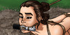
Image size
3600x3000px 13.49 MB
Mature
Comments5
Join the community to add your comment. Already a deviant? Log In
Overall this is a cool idea. You don't spell out the peril but it's clear enough, especially with the wine casks labelled and each heroine next to the appropriate one (and gazing at it warily in Frost's case). The villainess looks creepy, as villains usually should. And I like Frost's new hairdo.
What you could improve here is the composition. Teen Fire is partially cut off by the end of the frame--that's the most obvious issue, but so is the white wine barrel. A 5:4 or even a 16:9 ratio would have gotten everything into the frame and, potentially, positioned at the "rule of third" focal points.
One other minor thing--Frost's skin looks strangely dark. For someone with such light colouring otherwise, plus with ice/snow/cold powers, I kind of expect her to be quite pale. But if you're going for a different look, so be it.